The Evolution of a Logo

By Far one of the most iconic logos of all time is the ABC logo. The logo originally started as a microphone with the letters TV on opposing sides and ABC running directly through the center. Over the years this logo made ABC iconic but it was time to revamp the logo to what our generation knows it as. The black circle with the lower case ABC was brought onto the surface. The designer none other than Paul Rand. Paul Rand was an american graphic designer that created some of the most iconic logos that are still used today and well known. Besides ABC he also produced IBM’S logo, UPS, and Morningstar, just to give a few examples. Since Paul Rands addition to the ABC logo it has not changed much. They introduced a there dimensional logo but it was still based off of Paul Rand’s simple but powerful design. It was still a black circle with the white, lower case letters. The difference the circle was now given highlights and shadows to make it look as if it were a three dimensional object. They then took it back to the basics of Paul Rand’s design. They stuck with the three dimensional aspect of the design but instead of overcomplicating it they stuck with two simple highlights one at the top and one at the bottom. Like many logo ABC went through a series of works until they found a good one to stick with. Below you can see the evolution and slight changes that were made to the logo as time went on. I personally have only ever known the abc logo as the black circle with the white lettering so it was interesting to see the jump from the microphone to Paul Rand’s design. It was also impressive to see how many of today’s logos were introduced by Paul Rand. Next time you see a logo take a deeper look into it you might discover that the designer has made other logos that we are constantly in contact with.

ABC Logo
ABC Logo
Evolution Abc Logos
Evolution Abc Logos
Evolution of ABC logo

Success Stories from Bauhaus

Anni Albers  was born in Berlin. She first began by painting but was discouraged by her teacher. She then decided to attend art school. She began Her art education at a different school but eventually went over to Bauhaus. Due to gender restrictions on what women could take she was not allowed to take any architecture or glass work shops. Anni Albers went over to the weaving work shop where she fell in love. In 1925 Anni Albers married the infamous Josef Albers. Anni Albers had an extremely successful career being one of the first women to hold a solo show at the Modern Museum of Art in New York City.

Josef Albers began as a student at Bauhaus and moved up the ranks rather quickly. In 1925 the same year he married Anni Albers he was promoted to professor. Josef Albers was a jack of all trades. He worked in many artistic fields and accomplished a lot within photography, typography, printmaking, designing, as well as poetry. He is most renowned as a color theorist. Josef Albers painted in is early career and continued that when he emigrated to the United States after Bauhaus closed. Josef Albers influenced a lot of artist and his color theory is still influential in art education today.

Wassily Kandinsky was born in Moscow. He had a late start to his career as he began to study painting in his thirties.  Although he got a late start Wassily Kandinsky was extremely successful. It is said that he is credited for creating one of the first purely abstract works of art. Wassily Kandinsky like many artists taught at Bauhaus. He was there from 1922 until the school closed in 1933. Wasilly Kandinsky taught as a professor in the architecture department of Bauhaus. He is mostly renowned for his work with color and abstractions.

Like the three artist listed above, Anni and Josef Albers, and Wasilly Kandinsky a lot of well renowned artist crossed paths at Bauhaus. One can only imagine what a conductive woking environment Bauhaus must have been. It would be nice if there were an equivalent school to Bauhaus in the present day. Bauhaus truly knew how to produce successful artist especially with all that was occurring around them. It is incredible to see how many of these artist and the fundamentals that Bauhaus taught them still affect art education today. The spirit of Bauhaus will live on in every artist that thinks of design and its application.

Anni Albers
Anni Albers
Anni Albers
Anni Albers
Anni Albers
Anni Albers
Josef Albers
Josef Albers
Josef Albers
Josef Albers
Josef Albers
Josef Albers
Wasilly Kandinsky
Wasilly Kandinsky
Wasilly Kandinsky
Wasilly Kandinsky
Wasilly Kandinsky
Wasilly Kandinsky

Traveling posters

Edward Mcknight Kauffer was an American born artist. He was born in Great Falls, Montana. He later moved to London stopping at such cities as San Francisco and Chicago to study art. His poster-making career really took off in London where he produced one hundred and forty one posters for the London Underground, most focused on weekend getaways. His stylistic approach to posters was highly influence by the cubist movement. He displayed his scenes through large shapes that when put together created landscapes. Kauffer returned to the states once World War II began where he continued to work until 1954. (See Below for Kauffer’s work.)

A.M. Cassandre was another artist that excelled in travel posters. He studied at the Ecole des Beaux-Arts and the Academie Julian. Cassandre achieved powerful posters through the simplicity of his color and two-dimensional shapes. Cassandre’s strongest works were those that focused on railways and steamships. His use of color, shapes, and perspective made those posters extremely powerful. He later moved to the United States where he switched over to painting and focused on theater and ballet designs. (See Below for examples of Cassandre’s work.)

Austin Cooper another artist that focused on making posters for the London Underground achieved some pretty powerful posters. In his posters you can see where he derived his inspiration. His inspiration came out of the cubist movement. In the examples below you can see the cubist fundamentals such as shape being put to work. He even uses collage in one of his poster to imply traveling and the luxuries you can experience in Southern Paris. The color theory used for the Underground posters is simply wonderful. The slow change from warm to cool colors or from cool colors to warm for winter and summer respectively offer a huge statement without saying it out loud. There you see the influence of the cubist movement as the geometric shapes travel up the poster changing colors.

If you have not caught on yet there is a pattern here. I think that the most powerful posters were strongly influenced by the cubist movement. All three designers, Kauffer, Cassandre, and Cooper were strongly influenced by the cubist movement. Looking through their works you see the fundamentals, geometric shapes, flat colors, and layers. They all produced amazing works with simplistic designs that were easy to read. This approach to poster design is what made them extremely successful.

Kauffer
Kauffer
Kauffer
Kauffer
Kauffer
Kauffer
A.M. Cassandre
A.M. Cassandre
A.M. Cassandre
A.M. Cassandre
A.M. Cassandre
A.M. Cassandre
Austin Cooper
Austin Cooper
Austin Cooper
Austin Cooper
Austin Cooper
Austin Cooper

Cubism breaking all the Rules

I have always considered the cubism movement as the movement that breaks all the rules, at least visually. When you first begin to learn how to draw the first thing they tell you is that you need to learn how to see. You need to learn how to replicate what is directly in front of you on a piece of paper. You step away from drawing from memory and learn to truly draw what is in front of you. Cubist artists learn all of the rules. They learn how to replicate things and how to draw amazing realistic subjects to then break all the rules and transform the subject matter onto geometric planes.

At first it seems so simple. You draw everything on flat planes. But cubism is so much more than that. You need to understand the object and then deconstruct it to fit the planes and shapes of your choosing. Pablo Picasso and George Braque are the fathers of cubism. They took this movement and ran with it. They learned to control their visions and learned how to leave an image deconstructed. Their art pieces captivate you with all the geometric shapes and how your brain has to work backwards. You have to put all the pieces together visually to understand the subject matter. Even within the smallest plane of their pieces there is so much you can get lost in. Cubism gave them an opening to play with collage. They used collage to play with shapes and imply certain things without directly drawing them. Like I said at the beginning Cubism breaks all the visual rules, but that does not mean we should underestimate the work. In order to break the rules you should still learn the rules to fully understand something. So next time you see a piece form the cubism movement take some times to think about all the work that was put into the different planes of the piece.

Pablo Picasso
Pablo Picasso
George Braque
George Braque
Pablo Picasso
Pablo Picasso

Japanese Influences

In the printmaking world Japanese woodcutters are seen as role models of simplicity with a combination of intricacy. The Japanese invented what is called Key block printing. This means that every different color you would see on a print would be a different block. They perfected the art form of layering and creating depth through different colors and blocks. Below are examples of two different Japanese masters.

Katsushika Hokusai was most known as an ukiyo-e artist. Ukiyo-e means, “pictures of the floating world.” Hokusai produced about thirty five thousand works in his lifetime. He apprenticed under a woodblock engraver and then began painting and drawing. His work included everything from simple shells to full blow illustrations for novels. He produced large mount of work within his lifetime dipping his toes into a lot of different markets. (You can find examples of his works below.)

Ando Hiroshige was another Japanese artist. He was a Japanese woodcut master. His focus was on capturing nature and relating it back to ordinary people. His work influenced a lot of European impressionist. Hiroshige died in 1858 due to a Cholera epidemic. (You can find examples of his work below.)

Hokusai and Hiroshige were rivals. Although they were rivals you can see within their work that they focused on similar subject matters. They both managed to capture everyday moments and make them look tremendously beautiful. They also managed to capture some of Japan’s most iconic environments and capsulate the essence and mood of the space. Hokusai was able to create a large amount of work in his lifetime and although Hiroshige did not live as long as Hokusai, he produced an equivalent quality of work as Hokusai. Both of their works are amazing one can only wonder what they would have produced if they were not rivals and would collaborate.

Ando Hiroshige
Ando Hiroshige
Ando Hiroshige
Ando Hiroshige
Ando Hiroshige
Ando Hiroshige
Katsushika Hokusai
Katsushika Hokusai
Katsushika Hokusai
Katsushika Hokusai
Katsushika Hokusai
Katsushika Hokusai

The Art Form that is Art Nouveau

It always amazes me how many well-known artist were printmakers, artists such as Picasso and Toulouse-Lautrec. I believe it is important to know that lots of artist participated in this great art form that is truly the backbone of many art forms we practice today. Picasso created many etchings, he would simply carry a copper plate around with him and would scribe into the plate. Another example is Toulouse-Lautrec who is known for his paintings but hardly anyone knows that he was a phenomenal stone lithographic printer. Some of his most iconic works were lithographs. (Examples of his lithographic poster can be found below.) It’s important to see that famous artist took part in these techniques and it will maybe encourage artist now a days to try them.

Poster by Toulouse Lautrec
Poster by Toulouse-Lautrec

One of the factors of why I appreciate art nouveau so much is their use of text. As an artist that utilizes text in a lot of her pieces I know the painstaking time it takes to make/find a font that flows with the piece. Art Nouveau does an incredible job at making the text as fluid as the graphics behind it. A perfect example is Alphonse Mucha’s work. (Find examples below.) I enjoy the fluidity his pieces have between the graphics and the text. If you are an artist or simply designing a poster for a club you know what a struggle it is to find the perfect font that will not over power the piece but will still have the audiences’ attention. Art nouveau really captures that ability and made it an art form.

Alphonse Mucha
Alphonse Mucha
Alphonse Mucha
Alphonse Mucha
Alphonse Mucha
Alphonse Mucha

William Morris the Hipster

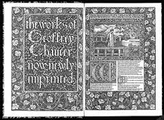
William Morris was the father of the Arts and Crafts Movement. He was against societies’ enthusiasm for the industrial revolutions. Much like hipsters today he appreciated hand made items. He brought back the interest in finely made items. He brought back the interest in finely made books and started the trend of the printing press houses. He opened his own press called the Kelmscott Press where he churned out intricate book designs made out of intricate designs, hand carved woodblocks, and handmade paper. (Below you may find some examples of the types of work put out by the Kemlscott Press.) Morris inspired many artists to go back to their artistic roots and to participate in the making of sturdy, well made products.

Much like hipsters now a days, Morris was against a throw away society. Morris attempted to make everyday items such as books or tapestry’s works of art. He brought back value on craftsmanship in a society that was focused on moving towards industrialization. We as a society should take notice on this way of thinking and should start to value craftsmanship skills. We have become a full on throwaway society where our mentality is, “I’ll just buy another one.” Where is the value in that? We should put in the work to make our possession feel valuable. To see something as simple as a book and see all the work that was put into making it. Lets all take some time and really think about how much we value our things; or is the throwaway society mentality so ingrained into our brain that we cannot possibly conceive something as simple as a book cover to be considered a piece of art that takes valuable skills to master?

William Morris Trademark
William Morris Title page from "The Works of Geoffrey Chaucer"
William Morris Title page from “The Works of Geoffrey Chaucer”
William Morris, A set of pages illustrating boarders, type set, Initials, and Illustrations

Getting Back to Printing’s Roots

Printing has become a lost art form that I truly believe artists should try once in their career. As I read about the industrialization of the printing press many thoughts run through my head. I think about how so many people lost their jobs because machinery could accomplish what many people could do at a faster pace. I think about all the techniques that are beginning to get lost. The ability to use a technique such as Lithography is amazing. In todays society we are use to being able to do everything on a computer, this especially applies to graphic designers. I believe that every graphic designer should take a print class to show them how printing was made and how it developed to the stage it is at today. Getting back to the hands on techniques where you, yourself have to make the image on the plate and have to manually work the printing press gives you a new appreciation on everything from the texture of the paper to the way the ink lays on the paper. Imagine being the artist that created the “Swedish Song Quartet,” or the artist that created the campaign for the Cleveland and Hendricks presidential campaign, or being Louis Prang and developing the lovely Valentine Card. You would do everything from mixing the ink to rolling it on the plate to manually setting and printing it. Yes, I know it sounds like a lot of work but in the end you get to see every layer build into this magnificent image and you can completely say I made that. I printed that wonderful image. The level of satisfaction is immense; it’s a completely different feeling than sitting at a computer clicking a few buttons and out pops an image. Yes, I know you do a lot more than that but printing gives you a different appreciation to the saying “let’s just print it.”

Louis Prang's Valentine Card
Louis Prang’s Valentine Card
"Swedish Song Quartet"
“Swedish Song Quartet”
Cleveland and Hendricks Campaign Poster

A look into the beginning of Language and the role art took

As I read the prologue I am overwhelmed with the sensation of gratitude and sadness. I imagine living in a world where language is barely coming into existence and it is not yet widely utilized. I am put under awe looking at magnificent pieces of artwork the illuminated manuscripts were. Every page was planned it took years to complete a single Manuscript.Three of the pieces that floored me were, the Chi-Ro page in the book of Kells, the Ormesby Psalter, and the Islamic manuscripts. All of the manuscripts listed above are exploding with details from the borders, illustrations, to the initials. In the Chi-Ro page its focus is to give an example of what an initial focused page can look like. You look at the piece and are lost in an abundance of details. As for the Psalter, it is suppose to bring light to what extent a boarder can be involved in the story. In this particular boarder it tells a story for those who were illiterate. Finally, the Islamic manuscripts brought all the elements of elevated boarders, initials, and illustrations and made amazing manuscripts that were laden with intricacy. All these manuscripts were cherished from the making of the parchment or vellum, to the ink that it took to actually have the ability to write these. To think that this process took so much time and now all we do is hit a button and we can have a million copies made is quite saddening. The advancement of technology has made a great art form disappear.

Chi Rho Page in the Book of Kells
Ormesby Psalter
Ormesby Psalter
Islamic Illuminated Manuscript